Accessing Edit mode
- Navigate to the Enhanced Layout page you would like to edit.
- You can browse your site to the page; or click Content in the Toolbar, then click the name of the article in the content list.
- You can browse your site to the page; or click Content in the Toolbar, then click the name of the article in the content list.
-
Click Sources in the tabs.
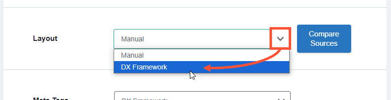
Note: If you do not see the Sources tab above the Enhanced Layout page title, please make sure you are logged in. If you are logged in and still don’t see the tab, you likely do not have the right user permissions. Please contact your Account Manager for assistance. - Scroll down to Layout. Click the dropdown and set the value to Manual.
- Click Save.
- Click the Edit tab.
After clicking Edit, the HealthHub visual editor loads with all of the existing content populated. The content will be made up primarily of Layouts and Components:
Editing existing content
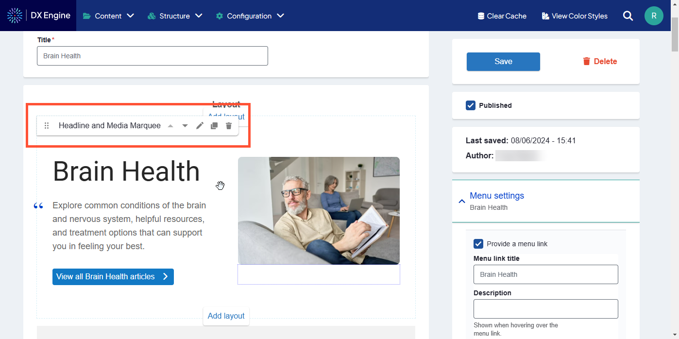
- Hover the mouse cursor over an item on the page to reveal its header tab. The header tab shows what kind of Layout or Component it is, and displays editing buttons.
-
Click one of the buttons in the header to edit the Layout or Component:
Icon Control Description 
Move Click and drag this icon to move the Layout or Component to another part of the page. Release the mouse button to drop it at a new location. 
Move up Click this to move this item up on the page. The item will swap places with whatever is directly above it. 
Move down Click this to move this item down on the page. The item will swap places with whatever is directly below it. 
Edit Edit the content in the Layout or Component. Each template has different fields and settings that can be changed. For more about each field, please see our reference article. 
Clone Copy the Layout or Component. A duplicate will appear directly below the copied item. 
Remove Delete the Layout or Component from the page. - When finished making changes, click Save.
Adding a new layout
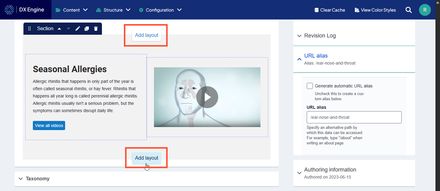
- In Edit mode, hover the mouse over a section in the article body to reveal an Add layout button above and below the section.
- Click Add layout at the top to add a new layout between this section and the section above it, or
- Click Add layout at the bottom to add a new layout between this section and the section below it.
- Click the type of section you want to add.
- Section: A new section with a configurable layout that can be manually populated with components.
- Number of columns (one through six), column widths, background & alignment, and heading can all be customized.
- Sections can have further elements placed inside them (see below).
- Editorial Marquee: A marquee that can display multiple links
- Marquee headline, flexible links, background image, featured image, background color, text and overlay can be customized.
- Hero: An image that takes up the full width of the viewable area with an optional caption.
- Marquee text, background media, height, width and overlay formatting can be customized.
- Parallax: Section of the page where the background scrolls at a different rate than the page itself, creating a 3D effect.
- Background opacity, section height, background color and image can all be customized.
- Headline and Media Marquee: A marquee with optional image and descriptive information.
- Marquee headline and subheadline, call to action, flexible links, breadcrumbs, background and overlay can be customized. An image or slideshow can be added.
- Marquee Carousel: A rotating set of marquees that can be customized to advance automatically or by user click.
- Marquee height, color, autoplay interval delay, pause ability, duration, and animation can all be customized. Each marquee slide can have customized colors, alignment, background image, and foreground text/image.
- Marquee height, color, autoplay interval delay, pause ability, duration, and animation can all be customized. Each marquee slide can have customized colors, alignment, background image, and foreground text/image.
- Section: A new section with a configurable layout that can be manually populated with components.
- Configure the added layout, then click Save to save the changes.
Sections
Adding a section is a placeholder for more types of content (including regular body text). You can add a section that is up to six separate columns across. A different component can be added to each column by clicking the + button inside the column itself.
Types of components that can be added into sections:
- Accordion: Section that can be expanded or collapsed (hidden) using the mouse.
- Accordion size, style, behavior (single or multiple), title and body can all be customized.
- Multiple panes can be added in the same section using the Add Accordion Pane button. If “multiple” is selected in slide behavior, all panes will expand/contract at the same time.
- Process List: Element used specifically for breaking out steps in a process.
- List numbering and orientation (horizontal or vertical) can be customized. Each step requires a title and summary. An external link can also be added to the step. Additional steps can be added using the Add Process List Step button.
- Card: Self-contained frame including information and possible CTA.
- Card title and body is mandatory. Orientation and media (image or video) can be customized. Links can also be added and customized. More links can be added to the same card using the Add Card Link button.
- Slideshow: Collection of images displayed one at a time with slide controls.
- Navigation arrows, thumbnails, navigation strip, caption position/background color/opacity can be customized. At least one slide is mandatory.
- Slide description can be added. More slides can be added using the Add Slide button.
- Description List: Element used for defining terms that are used throughout the site (like a glossary).
- Description Terms and Detail can be added. More entries can be added using the Add Description List Element button. Dividers and icons can also be added.
- Tabs: Headers that can be clicked to change the information displayed in the body area.
- Tab style can be customized. Tab title and panel (body) is mandatory for each tab. More tabs can be added using the Add Tab Panel button.
- Text: Simple text box.
- Only the text can be customized.
- Sticky CTA: Small button that remains fixed on screen if user scrolls, clicking reveals the CTA.
- Location on mobile devices, background color, overlay color & opacity, expandable section color, text color. Expandable button label and even external links can be added to the minimized CTA. CTA headline, description, and links can all be added to a CTA Expandable Item, which displays when the CTA is expanded. More buttons can be added using the Add CTA Button button. More expandable items can be added using the Add CTA Expandable Item button.
- Image: Basic embedded image.
- Width, border, border radius and shadow effect can all be customized.
- Image Gallery: Several images displayed together in a gallery.
- Gallery caption can be customized. At least one image is mandatory. More images can be added using the Add Image Gallery Item button.
- Form: Set of fields that can be filled out by the user and submitted to send data to a destination.
- This option is only used to select previously created webforms. Click Structure > Webforms in the DXE menu to administer webforms.
- Enter the title of an existing web form in the Form field and select from the quick search results.
- Form status (open, closed, scheduled) and background color can be customized.
- Submission data must be defined using YAML code.
- Menu: Navigation menu.
- Menu heading and contextual menu logic can be customized. If “contextual menu logic” is active, you can also customize whether the menu only displays the menu at the current context, shows the menu item, and shows the child links.
- Video: Embedded video.
- Thumbnail can be customized. You can also use an embed code. Background color and play control color/opacity can be customized.
Related Help Content
 DXE
DXE
How-to: Create or edit a Content Feed
Creating a Content Feed
DXE
How-to: Make a Listing Grid
Add a Listing Grid
HealthHub content
How-to: Add your own Enhanced Layout page
Adding your own Enhanced Layout page
HealthHub content
Reference: HealthHub Articles
HealthHub Articles are used for all of the singular topic articles in your HealthHub library. They are primarily text-based, although they support images, multimedia, and other Components. HealthHub Articles also support classification Taxonomy to help users filter their site searches, and to automatically populate Content Feeds with related information.
HealthHub content
Reference: Meta Tags
Meta tags are meta data applied to a page that change how the page behaves or appears in other contexts outside of HealthHub, such as:
HealthHub content
How-to: Create and place custom CTAs
HealthHub includes the capability to create custom CTAs and automatically place them in related HealthHub content. You can use these to promote your related services, link to related providers, or otherwise prompt the user for more engagement.