Overview
To work with blocks, click Custom blocks on the homepage to access the Custom blocks library.
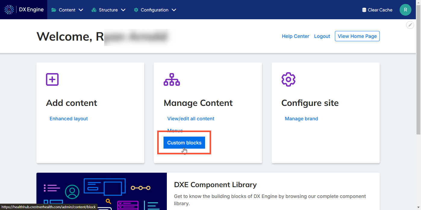
Custom blocks library
This is a list of the current custom blocks that have been created for your site. You can sort the list by clicking on a header, or using the Block description and/or Block type filters at the top and clicking Apply.
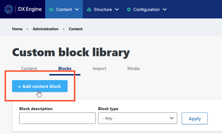
You can add a new block by clicking + Add custom block (see Adding a New Block).
You can edit a block by clicking Edit next to it.
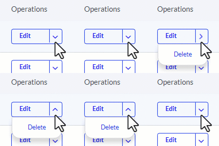
You can delete a block by clicking its dropdown arrow and selecting Delete.
Add a new block
Start by clicking the + Add custom block button when viewing Custom block library > Blocks.
Next, select a type of block to create. Some common block types are:
- Back to Top: A button that appears when the user has scrolled down far enough to where the header is no longer visible. Clicking the button returns the scrollbar to the top.
- Basic block: Block of basic text
- Content Conclusion: Block of text for use at the end of articles
- Embedded logo, block background (color or image) and border can be customized.
- Location CTA: Call to action block
- Image and link can be added
- Logo Block: Block containing just a logo
- Card Block: callout card
- Card title, body, links, image and orientation (horizontal or vertical) can be customized. Multiple links can be added using the Add Card Link button.
- Menu Block: Drilldown navigation menu
- Menu heading and contextual menu logic can be customized. If Contextual Menu Logic is active, you can also customize whether the menu displays links at current hierarchical context, whether parent menu items are shown, and whether child links are shown.
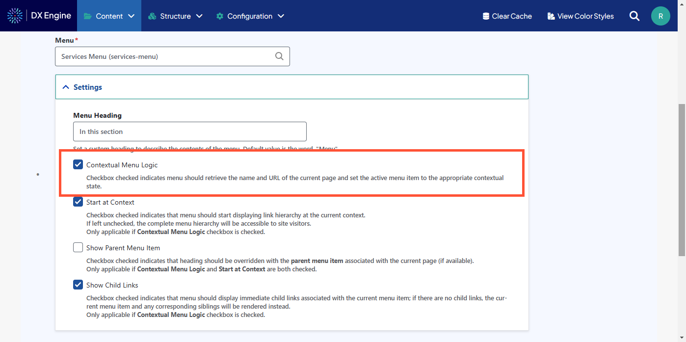
- Menu heading and contextual menu logic can be customized. If Contextual Menu Logic is active, you can also customize whether the menu displays links at current hierarchical context, whether parent menu items are shown, and whether child links are shown.
- Mercury Card Block: A callout card where a card title, body, button and optional image can be defined. This is a common block used for creating a CTA.
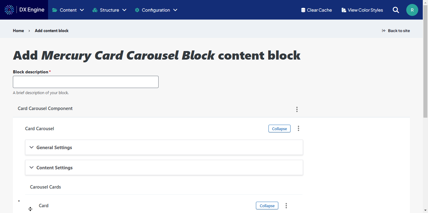
- Mercury Card Carousel Block: A rotating carousel of card blocks. The carousel speed, animation, and colors can be customized. Each card has a title, body, orientation, optional links, and optional image that can be set.
- Mercury Image Carousel Block: A rotating carousel of images. The carousel speed, animation, and colors can be customized. Each image has size, basic effects, and optional caption settings.
- Mercury Marquee Carousel Block: A rotating carousel of marquees. A marquee is a full-width banner intended to be a dominant message on a page. The carousel height, speed and animation can be customized. Each marquee has alignment, width, optional background image, and optional foreground image/text settings.
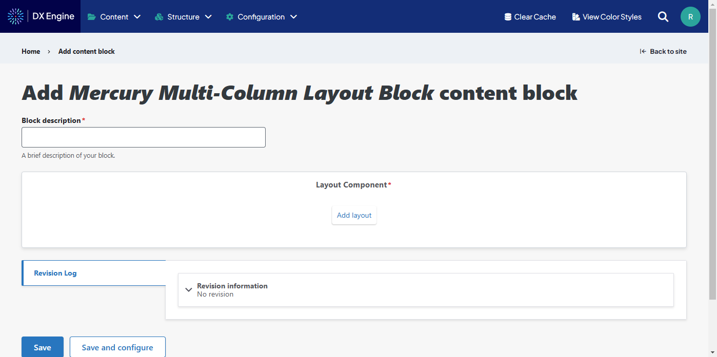
- Mercury Multi-Column Layout Block: A freeform block with 1 to 6 columns, and each column can be filled with components. Text components can be used, and links, images, and buttons can be added using the text editor.
- Sticky CTA Block: Small button that remains fixed on screen if user scrolls, clicking reveals the CTA.
- Location on mobile devices, background color, overlay color & opacity, expandable section color, text color. Expandable button label and even external links can be added to the minimized CTA. CTA headline, description, and links can all be added to a CTA Expandable Item, which displays when the CTA is expanded. More buttons can be added using the Add CTA Button button. More expandable items can be added using the Add CTA Expandable Item button.
- Mercury Testimonial Carousel Block: A rotating carousel of testimonials. The carousel speed, animation, and colors can be customized. An optional CTA can be added. Each testimonial can have a title, photo, text body, ratings info, and orientation.
- Social and Contact Block: Block with social media links and contact links
- Link and logo can be customized. Multiple social networks can be added to this block using the Add Social Network button.
In every type of block, there is a Revision log message field. When updating a block, it can be helpful to provide a brief summary of the update here. Revision information can be referenced later to understand when and why certain changes were made.
After creating your block, it will appear in the list under the Blocks view.
Block layout
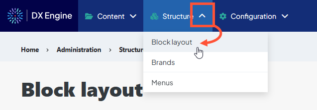
Access the Block layout screen by clicking the dropdown arrow next to Structure, then Block layout in the Toolbar.
Each page on your site is broken up into regions; however the regions that appear on each page vary. Different types of content have different regions available, and not all pages use all regions available to them. With that in mind, the following is a list of regions that can be selected:
- Site Alert
- Header
- Highlighted
- Breadcrumb (navigation)
- Content
- Pre Footer
- Footer
- Help
- Left Sidebar
- Right Sidebar
- Primary Content Column
- Featured Services for Services Search Page
- Location Page Alert
- Hidden Blocks
Most of these regions will simply disappear if nothing is placed in them. If a page does not use a region, any blocks placed in those regions will not be visible.
The following is an approximate mockup of the layout of regions on the screen:
| Site Alert region | ||||
| Header region | ||||
| [DX Engine header] | ||||
| Highlighted region | ||||
| [Header or hero from page content] | ||||
| Left Sidebar region | Primary Content Column region | Right Sidebar region | ||
| [Body text/content from page itself] | ||||
| Content region | ||||
| Pre Footer region | ||||
| Footer region | ||||
Adding a block to a region
First, the block of content you want to add must be created in the custom block library.
Click the Place block button next to that region’s header.

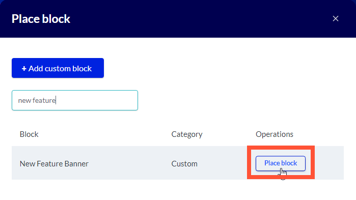
In the Place block modal, find the block you want to add. You can use the text box at the top to filter the list by name. When you find it, click Place block next to it in the list.
Below each section header, you’ll see a list of blocks currently included in this section. You can reorganize them by clicking the directional arrows next to the block and dragging the block to a new order in the list (see Rearranging, Disabling and Removing Blocks).
Next, you’ll configure the block.
Configuring a Block
You will navigate to this screen automatically when placing a block.
To configure a placed block, click the Configure button next to it in the Block layout list.
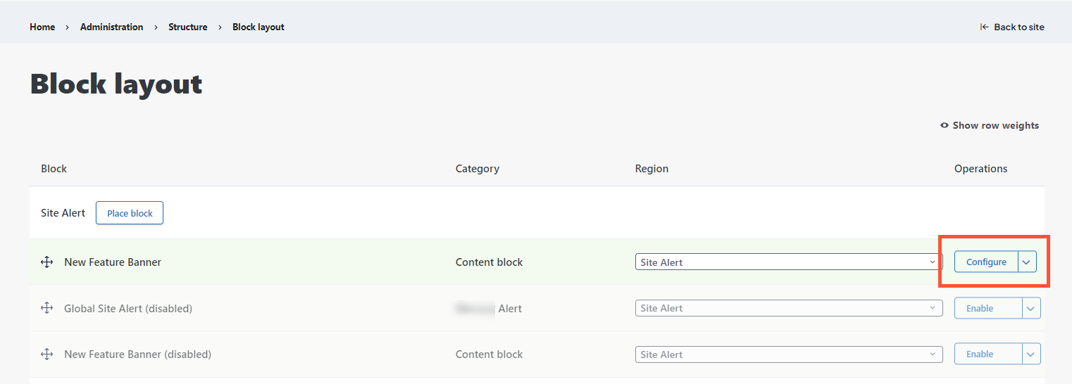
In this screen, you’ll see several options for configuring a block you’ve set.
- Title: This is a mandatory field. It defaults to the title used when the block was created, but it can be changed here.
- Display title: Checkbox, if marked, will display the title of the block on the screen in header font.
- Region: Another mandatory field. This defaults to the region identified when placing the block, but can be changed using the dropdown here to select a different region.
Beyond this, there are many visibility options (see Setting block visibiity).
After a block is configured, click Save block at the bottom to save the updates.
Setting block visibility
The visibility options are organized into 5 tabs:
- Variable: Textbox and inputs for a custom variable and value. If the entered variable meets the value qualification identified, the block will display.
- Variables can be created and assigned values using a UTM. Once a variable is assigned, it is retained in a cookie and can be referenced on other pages on your site.
- This is a useful tool for customizing the experience on your site. For examples of variable implementation, please see our Using Variables article.
- Response status: Checkbox list of server response statuses. Select all statuses for which the block should display. If nothing is selected, the block will display on all statuses by default.
- Pages: Textbox for inputting paths of pages in your DXE site.
- Paths are added one per line and begin with the lead “/” after your domain (e.g. “/home/page1”).
- Paths can include the * wildcard (e.g. “/user/*” includes every user page in the selection.
- If an entry starts with !, it is excluded from the selection (e.g. adding “!/user/jc” as a second line to the line above will select all user pages except jc).
- “<front>” can be used as an entry to select the front page.
- After your selection is determined in the textbox, you can use the checkboxes below to set whether the block is to be shown on your selected pages, or hidden from them (i.e. shown everywhere but there).
- Roles: Checkbox list, users with the selected roles will be able to see the block
- Leaving all unchecked defaults to “unrestricted” and any user may see the block.
- Content Type: Checkbox list of content types. Select all types of content that you want the block displayed on.
- Although you check boxes to indicate which content types you want the block included, leaving all unchecked treats it as “unrestricted” and the block can appear on all types.
Rearranging, Disabling and Removing Blocks
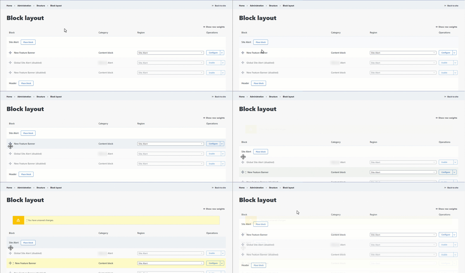
Multiple blocks can be placed in the same region. You can see them in the Block layout view. They will display in order from top to bottom.
To rearrange the order that blocks display in, you can click the four arrows icon next to a block, and drag it to the order you like. You will see an alert that you have “unsaved changes.”
To hide a block without deleting it, you can disable the block. This removes it from view, but leaves it in your block layout list for easy reactivation.
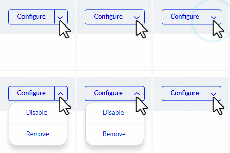
To disable a block, click the dropdown arrow next to it and select Disable. To reactivate a block, click the Enable button next to it.
In the same dropdown, you can delete the block by clicking Remove. You will have to confirm this selection. You cannot recover the block after deleting it, you can only recreate it.
To save any changes to your blocks, scroll to the bottom of the screen and click Save blocks.
