Overview
Content Feeds are a block that can be configured and automatically placed on pages using visibility settings. The content in the feed can also be automatically managed by setting rules for the kind of content that should be included in the feed-any new content created that fits the criteria will automatically be included in the feed.
Some common use cases for Content Feeds are:
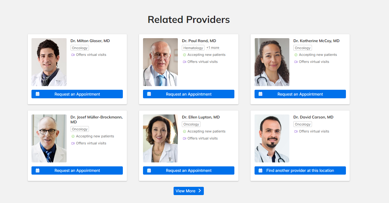
- Displaying a list of providers, sorted by relatedness to the page topic being viewed
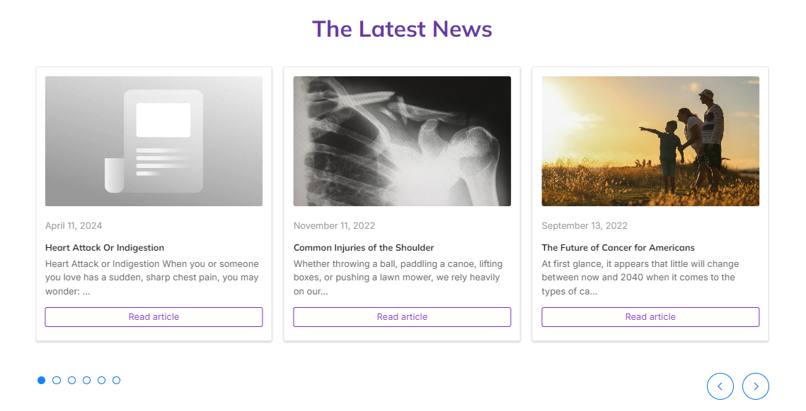
- Displaying a list of news articles, sorted by publish date
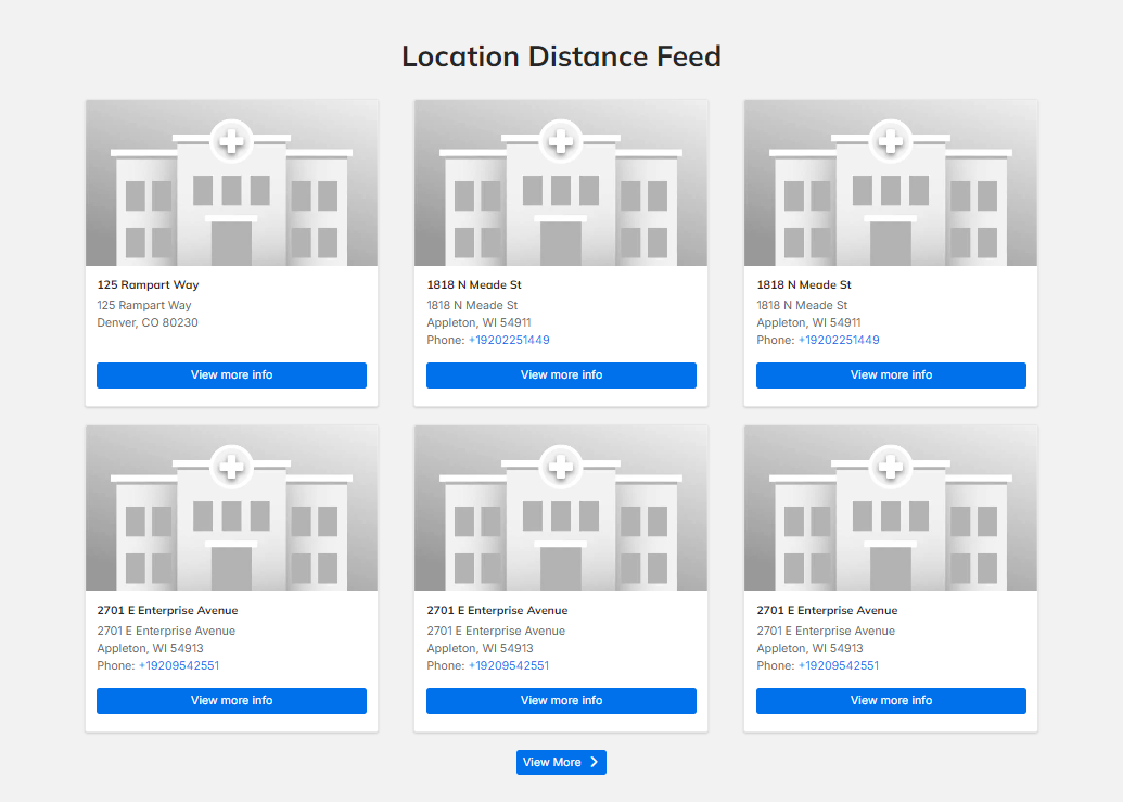
- Displaying a list of locations, sorted by distance from the user


Content Feed settings
- Title: (Required) Title of the Content Feed.
- Display title: Checkbox, if marked, will display the title of the Content Feed on the screen in header font.
- Subheading: Optional text to display below the Content Feed title and above the Content Feed tiles.
- Text format: (Required if a subheading is entered) Dropdown to select the text formatting for the subheading. "Plain text" will use H4 formatting.
-
Selection Method: (Required) Set how content is automatically populated in the Content Feed.
 Note: If the selection method doesn’t find any results to include in the feed, the Content Feed will not appear.
- Relatedness: Content will be generated automatically based on taxonomy terms shared with the current page.
- Relevance: Content will be generated automatically based on semantic similarity to the current page.
- Term(s): Only content with at least one of the specified term(s) will be displayed.
- Term(s) to match: Enter each matching term one at a time, clicking the appropriate term in the autocomplete suggestions. Click Add another term for any additional fields to match.
- As terms are entered, you can see which vocabulary each term belongs to. This helps you click the correct autocomplete suggestion and populate the intended content.
- Content Type: For HealthHub, this field should be set to Health Hub Article.
- Manual: Only the specified items will display.
- Content to display: Enter the title of each content one at a time, clicking the appropriate autocomplete suggestion. Click Add another item for any additional content.
- View: Select how the items in the Content Feed display. Choose between: Card, List, List (wide), or Carousel.
- "List" is intended for use in sidebars, smaller column areas, or to mimic a blog roll. Use "List (wide)" for wider areas.
- Background Color: Select a background color for the feed using the color picker.
- Headline Color: Select a color for the Heading and Subheading using the color picker.
- Maximum Cards Per Row: (Appears only if Card view is selected) Select between 3 or 4 cards to display per row of content.
- List style: (Appears only if List, or List (wide) view is selected) Sets which elements of each item are visible in the Content Feed. Choose between: Show all content elements, Hide content image, Hide content details, and Hide content image and details.
- Link Color: (Appears only if Carousel view is selected) Set a custom link color for the View More link using the color picker.
- Carousel Autoplay Interval: (Appears only if Carousel view is selected) Set the duration that each slide of a carousel remains on screen (in milliseconds, must be at least 1000).
- Pause: (Appears only if Carousel view is selected) Set the duration that each slide of a carousel remains on screen (in milliseconds, must be at least 1000).
- Carousel Animation Duration: (Appears only if Carousel view is selected) Set how long the carousel takes to animate in new items (in milliseconds, must be at least 1000).
- Carousel Animation Timing: (Appears only if Carousel view is selected) Set easing of the animation.
- Carousel Visible Slides: (Appears only if Carousel view is selected) Set the number of slides visible at once (default is 3).
- Carousel Slide Padding: (Appears only if Carousel view is selected) Set the size of the padding between Content Feed items (in pixels).
- Maximum Number of Cards: Set the maximum number of individual items visible in the Content Feed at once.
- Sort By: Set how the items in the Content Feed are sorted. Choose from: Title (A to Z), Title (Z to A), Created Date (Newest to Oldest), Created Date (Oldest to Newest), Event Date, Provider Order, Random or Relatedness.
- View More Link Behavior: Set whether a View More link is available. Viewers can click this link to open a new browser tab to view and filter a full list of items of that content type.
- Visibility: These options define the conditions in which the Content Feed will appear on screen.
- Variable: Textbox and inputs for a custom variable and value. If the entered variable meets the value qualification identified, the block will display.
- Variables can be created and assigned values using a UTM. Once a variable is assigned, it is retained in a cookie and can be referenced on other pages on your site.
- Language: Can set the language(s) in which the block will appear. If no languages are selected, it will display for all languages by default.
- The Language dropdown is also set to Interface text by default, which will attempt to translate the block content automatically.
- Response status: Can set the server response statuses for which the block will appear. Options are Success (200), Access denied (403), and Page not found (404). If no boxes are checked, all statuses are selected by default.
- Pages: Textbox for inputting paths of pages in your site.
- Paths are added one per line and begin with the lead “/” after your domain (e.g. “/home/page1”).
- Paths can include the * wildcard (e.g. “/user/*” includes every user page in the selection.
- If an entry starts with !, it is excluded from the selection (e.g. adding “!/user/jc” as a second line to the line above will select all user pages except jc).
- "<front>" can be used as an entry to select the front page.
- Roles: Checkbox list, users with the selected roles will be able to see the block. Leaving all unchecked defaults to “unrestricted” and any user may see the block.
- Content Type: Checkbox list of content types. Select all types of content that you want the block displayed on. Although you check boxes to indicate which content types you want the block included, leaving all unchecked treats it as “unrestricted” and the block can appear on all types.
- Variable: Textbox and inputs for a custom variable and value. If the entered variable meets the value qualification identified, the block will display.
- Region: (Required) Set the region of the page in which the Content Feed will appear (as long as the Visibility requirements are met). This is set to the Region selected before but can be updated here. Options are:
- Site Alert
- Header
- Highlighted
- Breadcrumb (navigation)
- Content
- Pre Footer
- Footer
- Help
- Left Sidebar
- Right Sidebar
- Primary Content Columns
- Featured Services for Services Search Page
- Location Page Alert
- Hidden Blocks

